ODD SOCKS CLUBBuying socks remixed
A fictional shopping app for mismatched socks with Mix & Match, Slot Machine, limited drops, clear checkout and a playful digital experience.


Webshop fordeliberatelymismatched socks
Sock shopping feels purely functional. Assumptions and observations told a different story. Many users want individuality. And are open to play.
One guiding question. How do we celebrate mismatched socks? And make shopping feel playful?
Primary target: 16 to 35, mobile‑first. Open to Mix & Match and the Slot Machine. Parents and sustainability‑minded buyers as secondary. Validated through usability tests.
The answer is a fictional e‑commerce app. Mix & Match, a Slot Machine and monthly drops turn sock shopping into a surprise.

From moodboardto principles
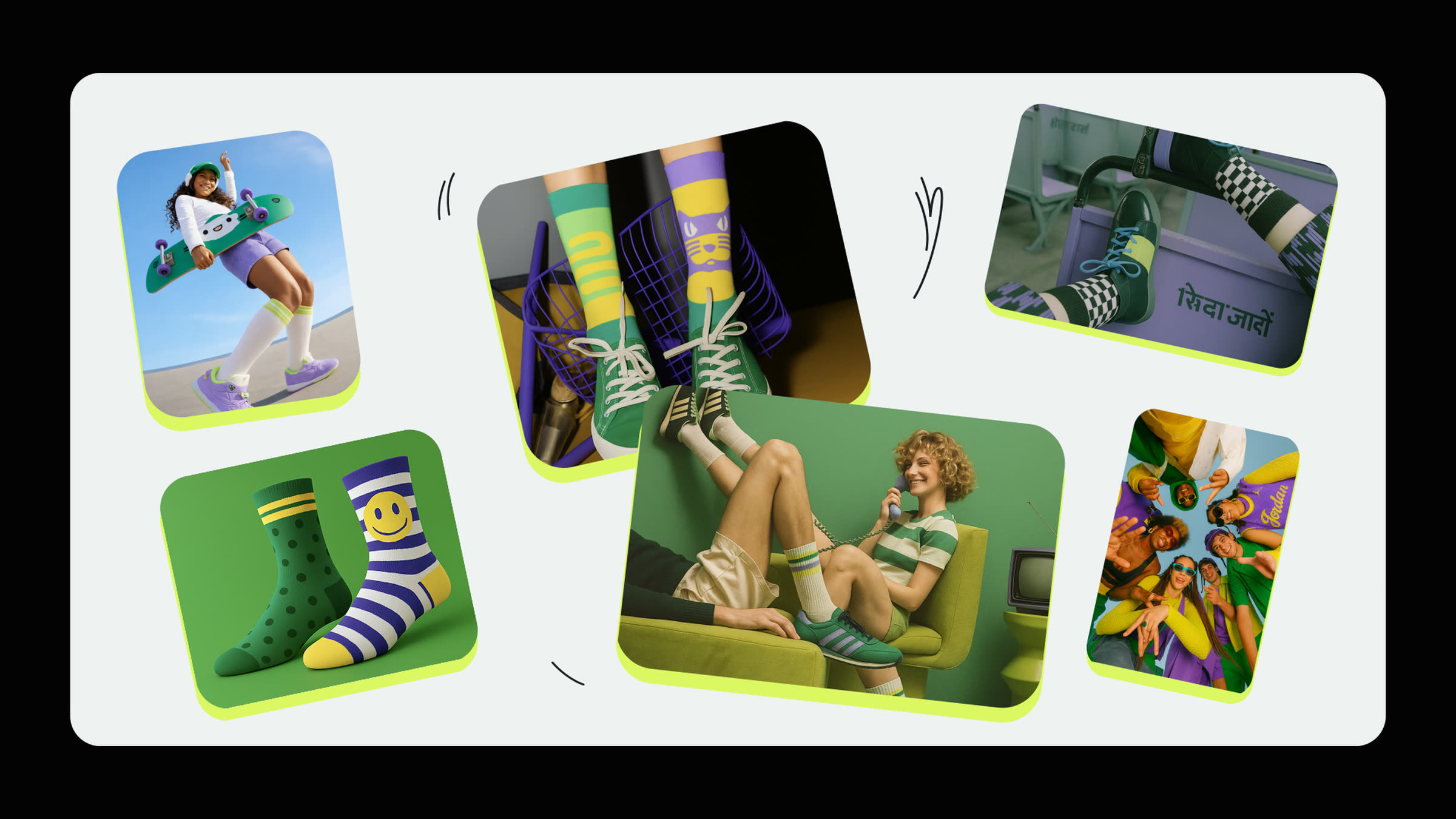
The moodboard captures the mood: young, dynamic, playful.
It sets the tone without pre‑empting the brand.
Four principles grew out of that mood. Voice, visuals, interaction.
Carried through the whole app. Playful Simplicity. Celebrate Oddity. Community First. Joyful Discovery.
A brandon one page
The design principles become visible in the styleguide:
bold colours and clear contrasts underline the app's playful character.
Typography pairs solid readability with bold headlines. A balance between clarity and humor.
Lively motifs and unexpected combinations carry the concept. Deliberately mismatched socks.

Gamificationmeets shopping
The user flow reflects the hypothesis: gamification and classic shopping blend seamlessly, with the Slot Machine early in the journey but always optional.
The home screen is the central entry point, with all main areas instantly accessible: shop or Mix‑&‑Match, with one tap.
The flow helped validate assumptions. The path to checkout stayed clear and intuitive.

From flowto fully built
Wireframes tested structure and flow. Navigation and user guidance in focus.
Prototype and user flow focused on the Slot Machine as the central playful element.


Sockin the City
Mockups of a billboard series show how ODD SOCKS CLUB might feel beyond the app. The character at centre stage, minimal in the cityscape, playful like the app.


What fits
Four weeks of teamwork with Arabella Zeciri, with lightness, humor and trust. Idea, research and testing. A clickable prototype brings gamification and classic shopping under one brand.
Four design principles set the tone: Playful Simplicity, Celebrate Oddity, Community First, Joyful Discovery. A playful presence with high ambition. A checkout without detours.
"Perfectly imperfect, just my kind of thing."

Learningsand insights
Findings from the Maze test and internal tests. Sorted along three axes: what holds, what gets sharpened, what users expect.
What worked
- Slotmachine = highest interaction
- Mix & Match = users spend more time
- Branding rated extremely positively
- Mix of fun and shop worked
What we will improve
- Shorten checkout
- Explain Mystery Box
- Add a replacement function
- Refine size selection
- Add quantity selection
- Expand product details (material)
Insight
- Users want shopping that is easy, surprising and personal.

